

When we all got used to Flat Design BOOM! something new jumped in. Or at least this is how it seemed. But is this something really new? It’s called Material Design, a fancy name that we haven’t heard before, so yes, it sounds new, but let’s take a closer look into it.
Flat Design has been around for a while now, we have discussed about it in another blog post (Flat Design: Past and Future). It has its advantages and of course disadvantages. The main problem with Flat Design is that it removes all three-dimension visual illusions and this happened because people tend to exaggerate. It was proven that minimalist design is better in many ways, so we started stripping off more and more design elements, till we reached a critical point.
What Google tried was to address this exact problem. The thing is that Google was not exactly the first one to do this. We have seen Flat Design with shadows and animations on websites even before Material Design. However, we never thought about it as something else. Flat Design is just a design trend and anyone is free to add a personal touch and create unique websites. It seems that what Google did was just to put a name on 3D Flat Design: Material Design.
So there’s not much new, but is it better?
There’s nothing wrong about adding another dimension to Flat Design. Some of us were doing it anyway, others would have started doing so. The real problem is that Google created some specs for Material Design that I’m not fan of.
The same way Flat Design went too far, cutting off too many design elements, Google’s Material Design added in too many style details, such as buttons or menu padding, width or height. It seems that Material Design hasn’t learned too much from its predecessors' mistakes.
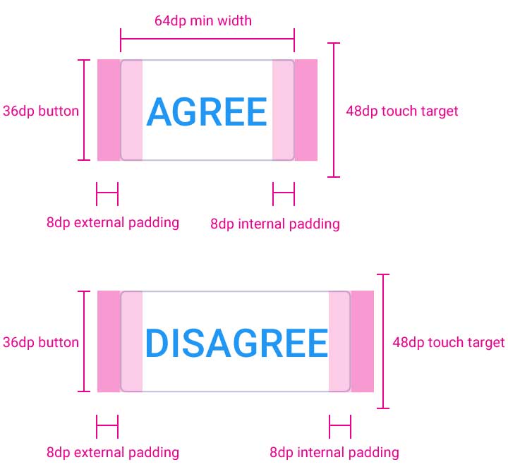
Imagine how websites will look like if they use Material Design’s principles, and also use the exact padding, margin, width, height and so on. You might say they will all look Google-like, perfectly true, but the real issue is that the whole Internet will look the same. So Google’s Material Design doesn’t leave you too much room for making your website unique.
Another concern would be the impact of motion graphics. Despite the fact that too many animations will take us back to square one, where the cluttered interface makes important information hard to see, this might also be a huge problem for performances. So you might want to be careful with this too.
The big question: Should I use Material Design?
Material Design has pros and cons, so the best thing to do is to pick those characteristics that feel right to you. While doing so you must not ignore important aspects:
- Let users know what’s clickable and what's not by adding the three-dimension illusion.
- Pay attention to the information you want to convey to your users and make sure they are not distracted by too many animations.
- Don’t ignore performance.
- Make sure your website is unique.
If you’re planning to use Material Design following the specs exactly, keep in mind that in the online world very often success is a matter of design, if your website doesn’t have a design that stands out from the crowd you might lose the fight with your competitors.
Have you started using Material Design or plan on doing so? Feel free to share your website or your thoughts with us in the comments below.
No comment yet, add your voice below!